Design notes
A study in colour & contrast
Olive, burgundy, navy and cream. A palette with a point of view.
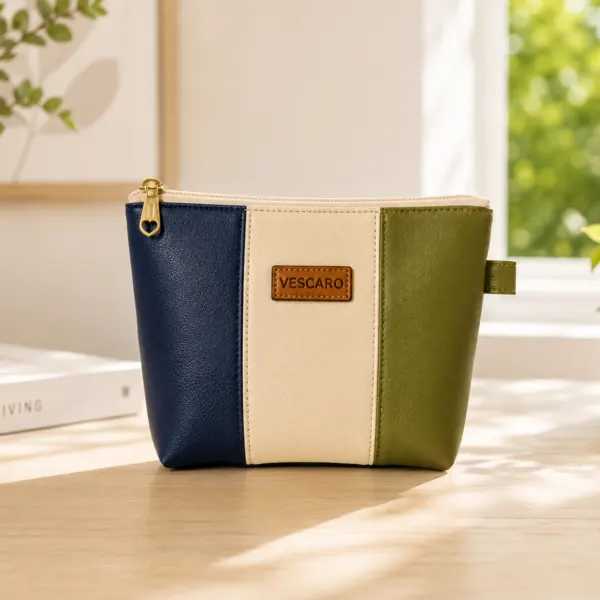
The quiet character of colour
Colour changes the character of a familiar shape. An olive panel beside cream feels different from navy beside burgundy, even when the silhouette is the same. That simple contrast is at the heart of the VESCARO colour edit.
Find your own palette
Start with the colours already in your everyday world. A navy bag might pair naturally with a cream split pouch. A neutral dressing table might invite a little olive or burgundy. Matching is one approach; a considered contrast is another.
Our colourblock pieces explore central stripes, divided panels and diagonal lines. Each brings a different rhythm to the same everyday purpose.